After years of working with clients to design romantic spaces that don’t sacrifice beauty for function, I’ve learned to begin each project with a couple revealing questions:
1. How do you hope to live in your space?
2. What is your pièce de résistance?
More From Veranda

With this house, I’ve tried to treat myself as the client for the first time. And in our kitchen, our home’s heart, the answers to these two questions couldn’t be more important. We start and end each day in our kitchen; it’s where we gather for creative projects, enjoy meals, and entertain our friends and loved ones. Every inch of the design must be purposeful.
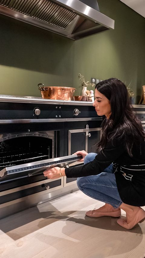
Let’s begin by answering my second question. Luckily, our pièce de résistance—the focal point, the true showstopper—was clear to me from the very beginning. The most remarkable feature in our kitchen is our oven. It may sound like a humble kitchen tool, but trust me: This oven is amazing.
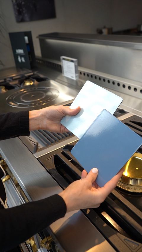
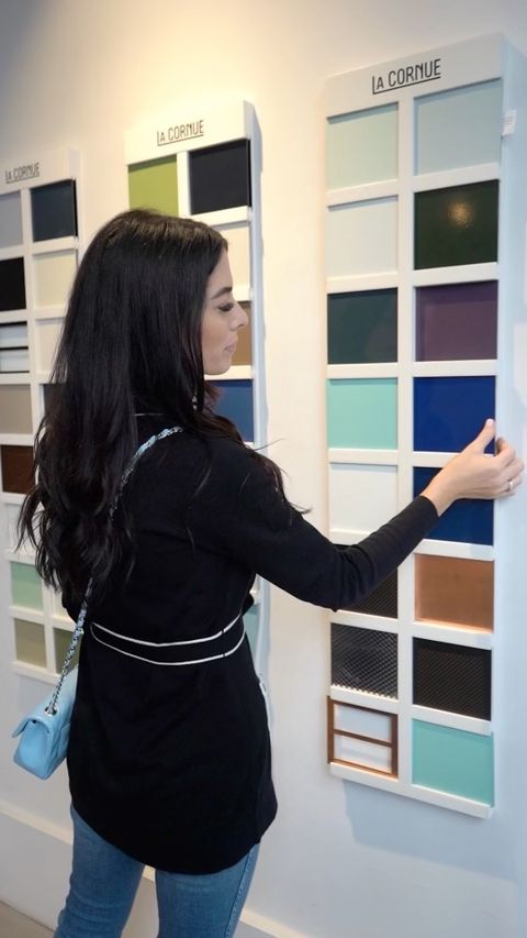
Sourced from the Paris-based La Cornue, a brand known for its attention to detail and craftsmanship, our luxury range is at once elegant and classic. Its brass handles resemble cabinet hardware. The trim detail transforms it from an appliance to a work of art. The 71-inch range gives us the space we need when we’re entertaining. Best of all, La Cornue worked with us to customize the color—a peaceful shade of blue I was able to create in my studio.
But I’m getting ahead of myself, maybe because the answer to my first question, the one about how we hope to live in our space, is a bit more complicated.
If you’ve been following along with my renovation story, you know that our new kitchen is in the space that was formerly the master bedroom. You also know that we’re keeping the home’s original kitchen, and we’re calling it our “hidden kitchen.”
For now, let’s spend some time in the main kitchen exploring how we hope to live in this space—and how a beautiful and functional design can alleviate some common kitchen challenges.
Introduce a Soothing Color Palette
In almost every home, kitchens are the center of the action. They’re crazy and they get messy. That’s especially true at our house, where five children and two adults each have their own activities and agendas. Amid the bustle, achieving a peaceful energy wherever I can is a big priority for me.
Like the rest of the house, our kitchen has a formal aesthetic. Architectural details include a beautiful arch window, pilasters with fluting detail, and intricate plaster molding.
That doesn’t mean, however, that our kitchen can’t or shouldn’t be soft, inviting, and comfortable. We’re going with a light and fresh color palette, with shades of pale blues and sophisticated, deeper greens. The countertops, a soothing calacatta marble, will seamlessly flow into the backsplash.
One of my favorite things about our kitchen is the natural light that streams in through a wall of windows. I want to our family and friends to feel that same, warm glow after the sun sets. To set the mood and achieve a sense of artistry, I’ll use a mix of lamps and wall sconces, canned lighting, pendants and chandeliers. With the proper placement, you can have light dance just the way you’d like it in any room.
Make Day-to-Day Items Accessible
If you have children, this scene might sound familiar: An ambitious 3 year old is convinced she can do everything—all by herself—so she transforms the lower cabinet hardware into her own personal climbing wall. After scaling each drawer, she stands barefoot on her summit while she reaches for something breakable.
In a serendipitous way, our pièce de résistance solved this kitchen challenge. Because we wanted the range to take center stage, we chose to place it between two islands. Now it’s the focal point regardless of where you are in the room. Not only does a double island offer plenty of seating, it accommodates low, pull-out drawers that are easily accessible for children.
Another cheer for the double-island: As a creative person with an artistic mind, I can make a total mess when I cook. Two surface areas will help by doubling our homework, cooking, and art-project space.
Embrace the Unexpected
All good design is layered, and that takes time. As much as I try to plan, I have to remember that moments of creativity strike randomly. My best “ah-ha” moments usually result from surprise elements at some point in the process. Sometimes they even happen out of mistakes.
Understanding how we want to use the space and having a clearly defined focal point gives us a great starting point, but we’re still in the discovery process. Each surprise opens new doors—and that’s the exciting part.
This is part one in our Along for the Revival series with Caitlin Wilson. Get caught up with the rest of the series here.


